
UX / UI DesignUser ExperienceWeb Dev
Locca Coffee
Main Idea
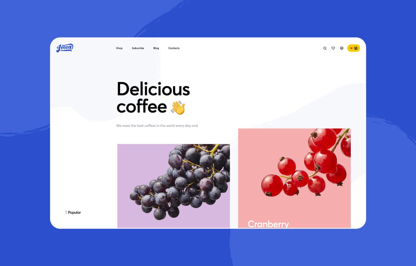
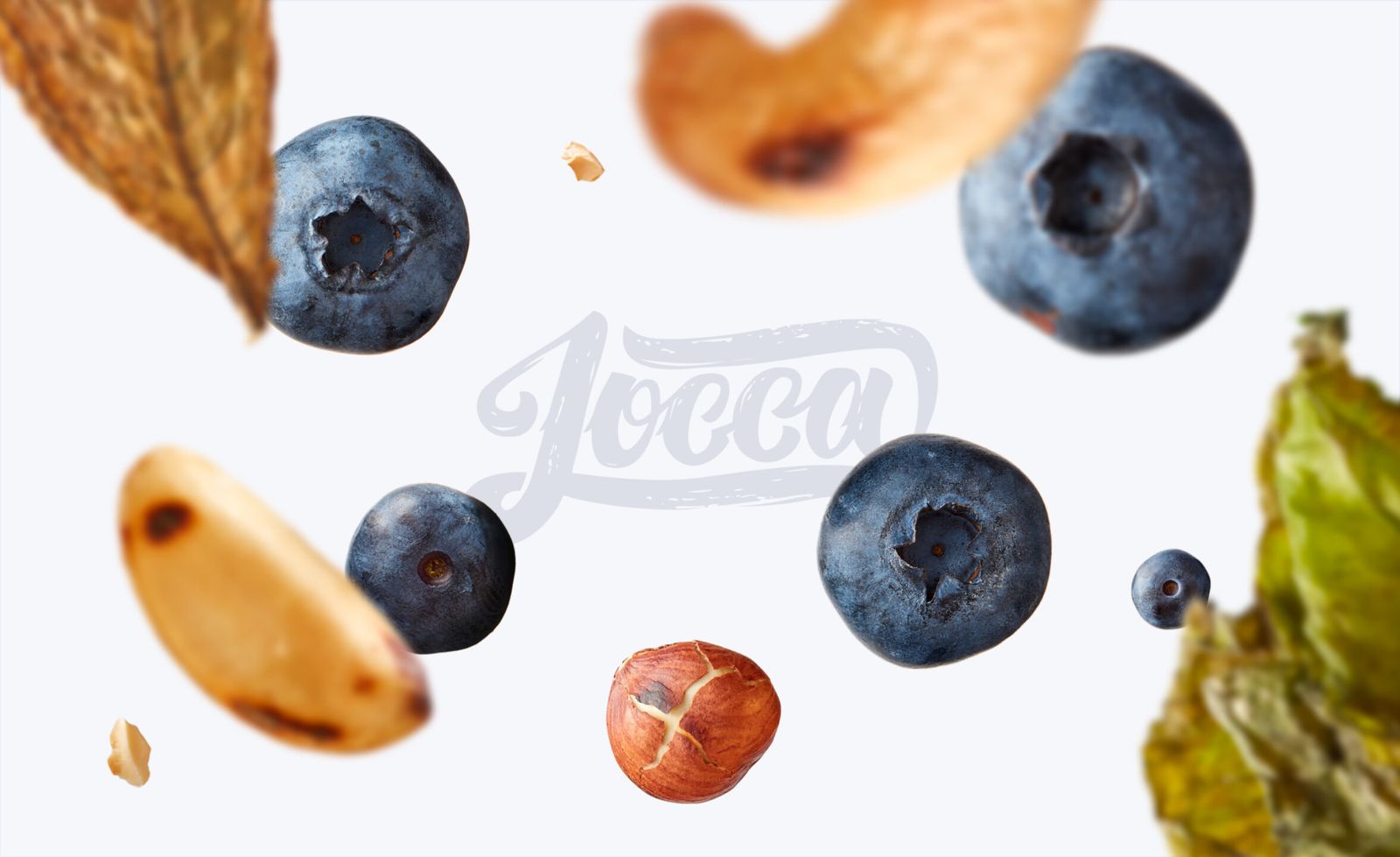
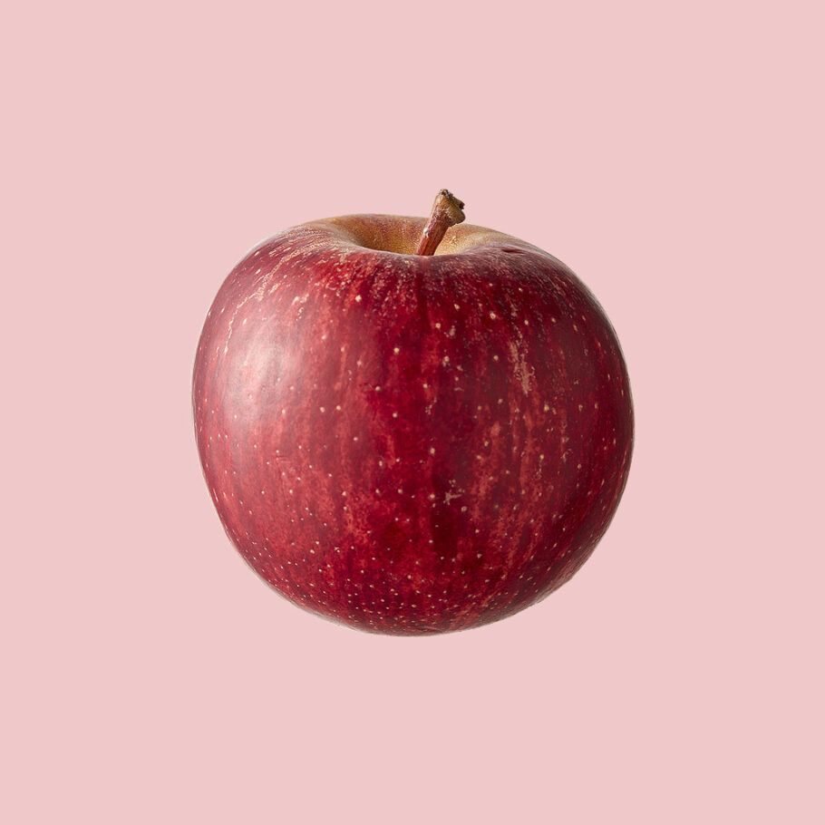
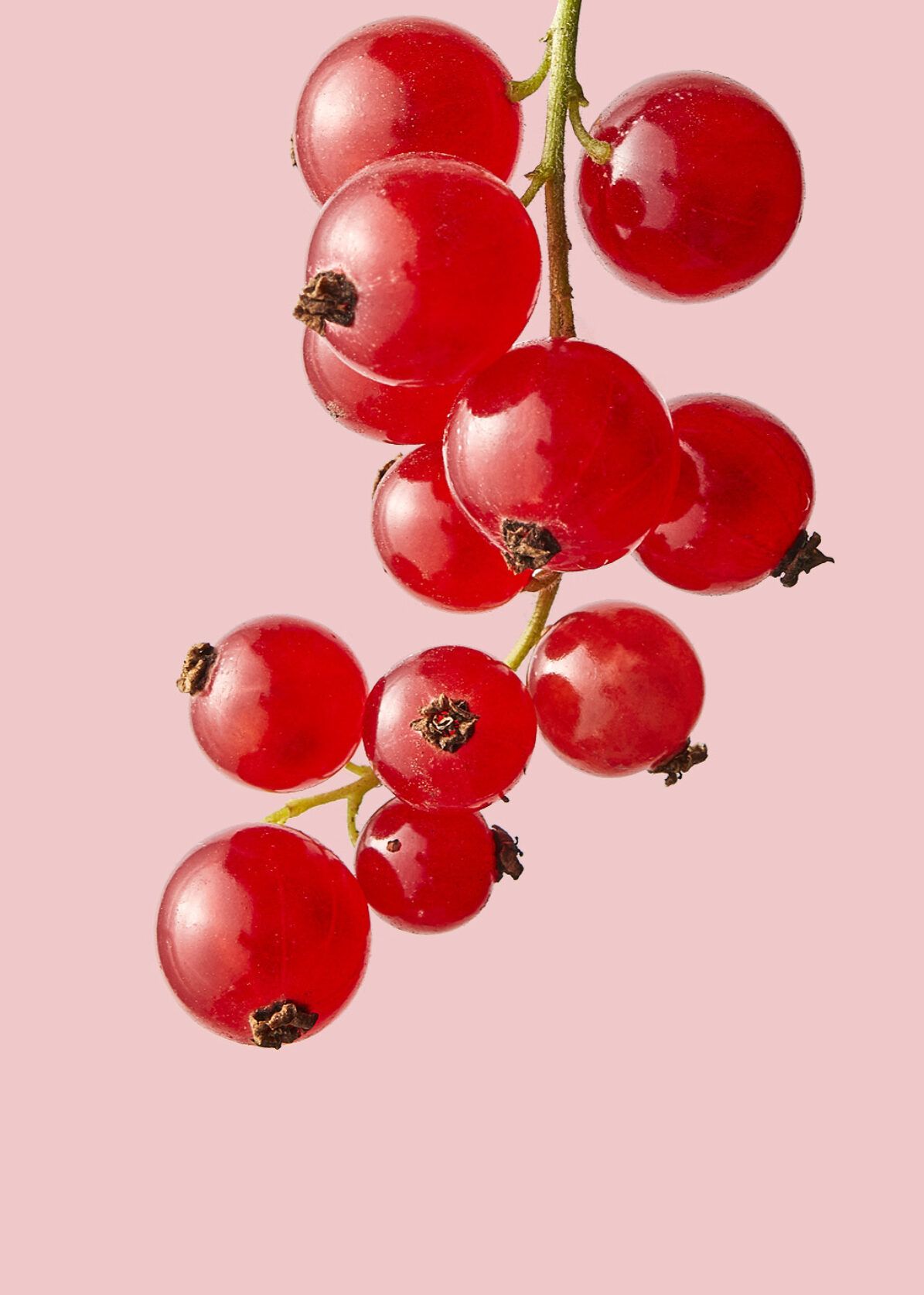
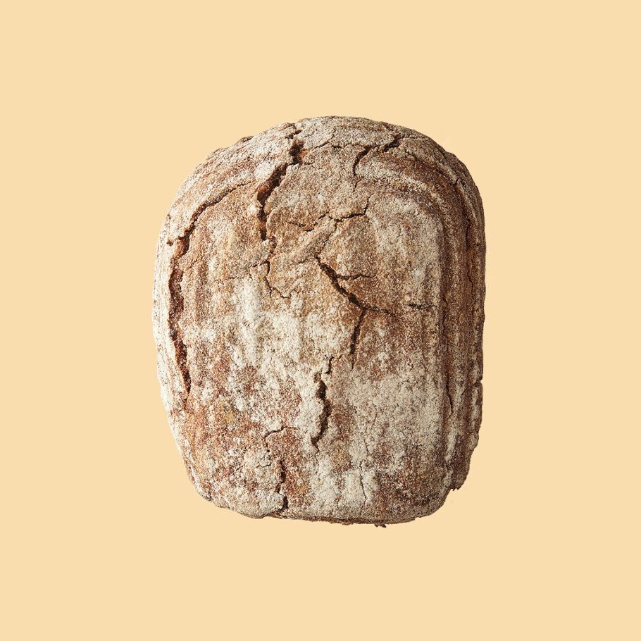
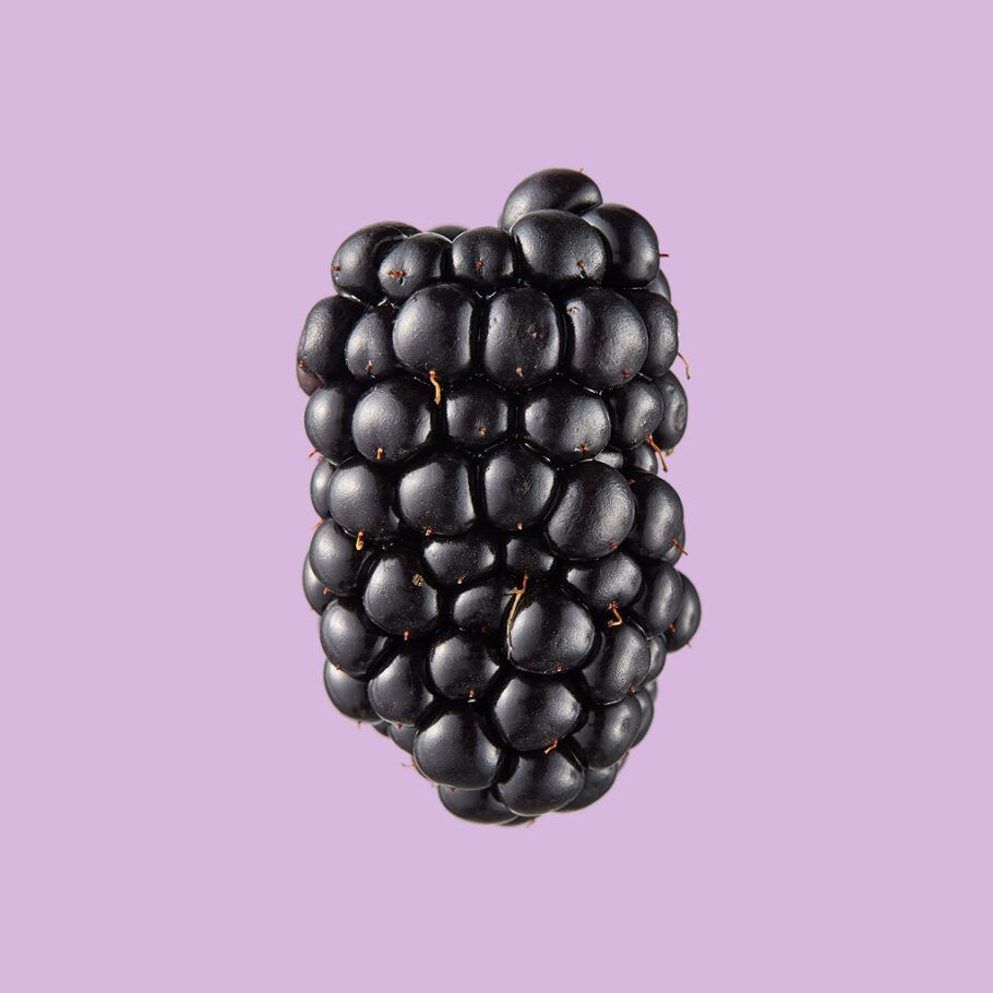
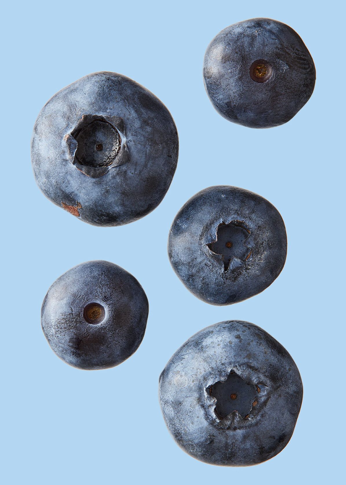
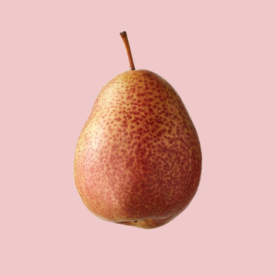
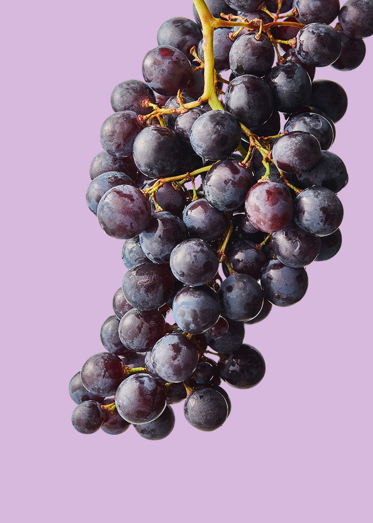
Analyzing all the other online coffee shops, we decided to try another way — instead of showing coffee packaging in the catalog and on product cards, we show the taste itself. If a coffee has chocolate notes, the image should be a photo of chocolate, not a pack.
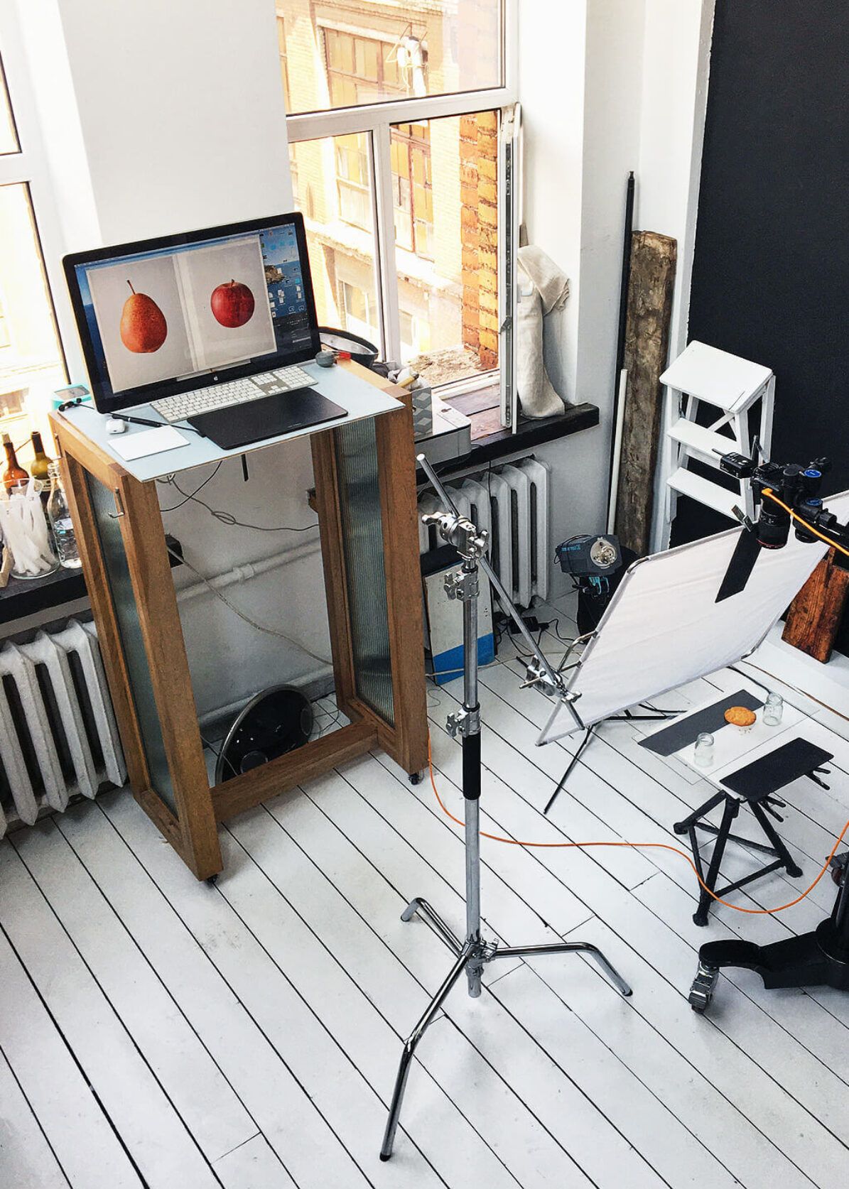
Food Photoset
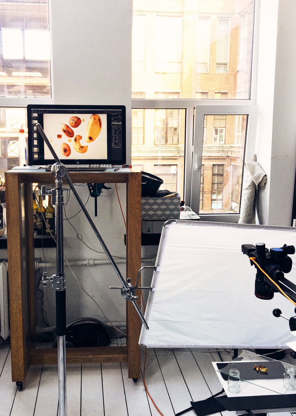
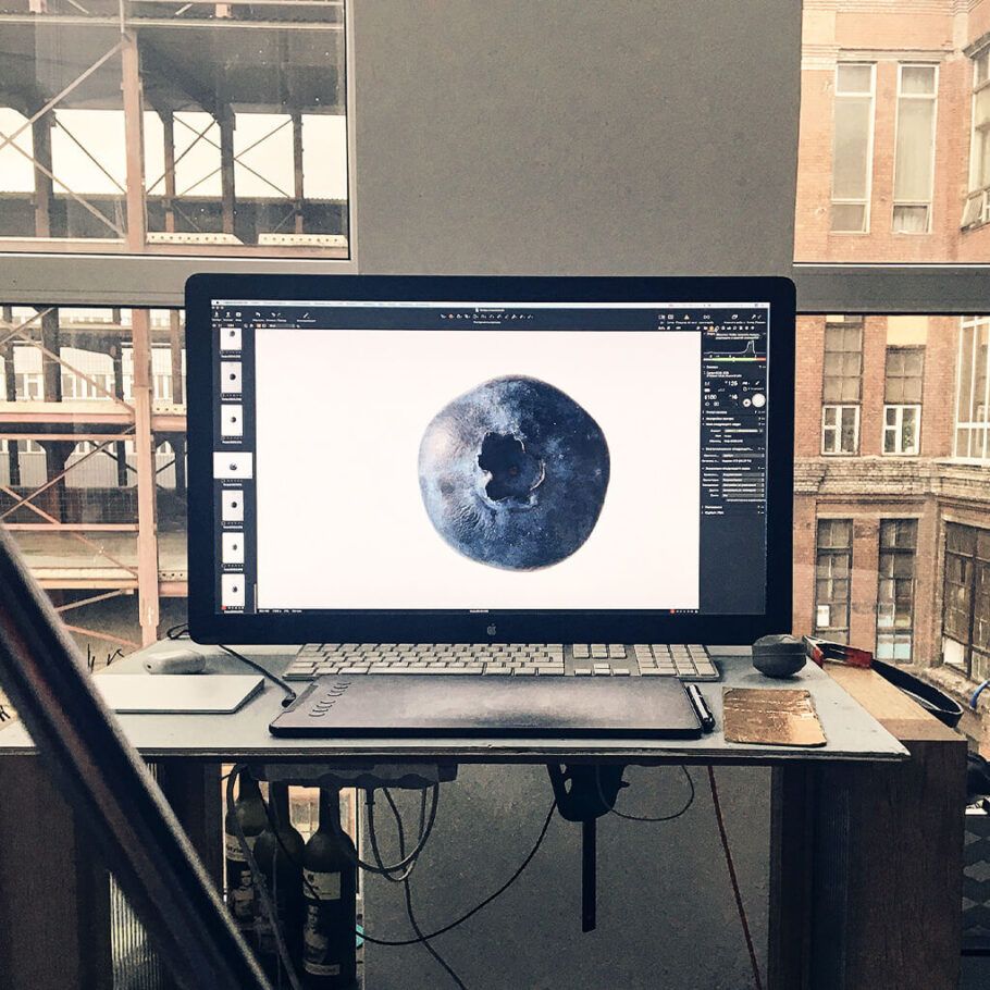
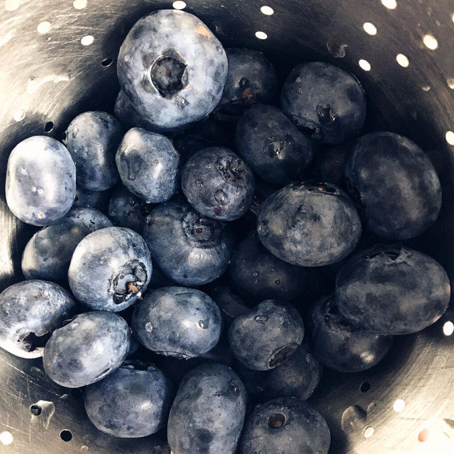
For higher quality images, food photography was performed in a professional studio, with the preparation and processing of the material assisted by a food stylist. The photos exceeded our expectations, which matters all the more considering that this is in fact the face of the product and the site.
Coffee for You
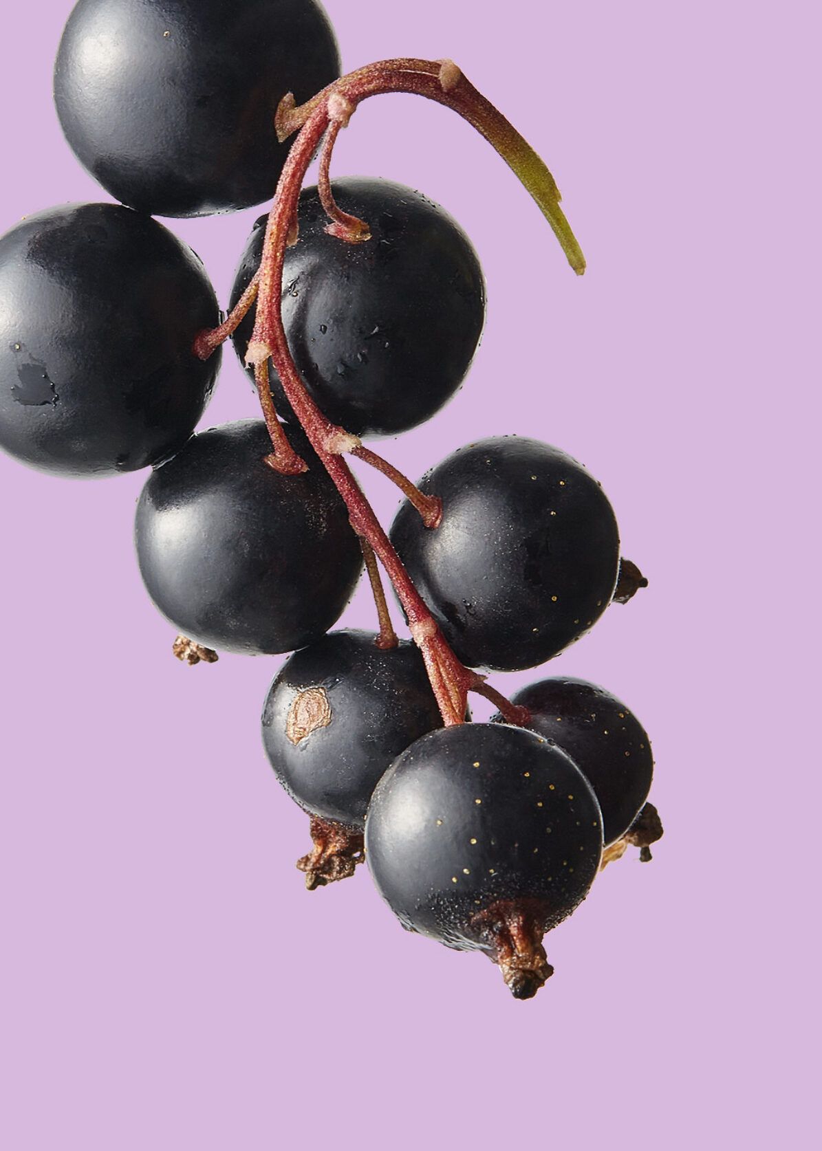
For your convenience, we have divided coffee flavors into several colors. On each coffee card in the catalog, you may notice a color mark. Each color represents the basic notes of the coffee flavor.
For example: purple is a rich flavor based on dark fruits and berries. Can combine wine and dried fruit aromas, including plum, port or grape.
Taste Instead of Packaging
For every item in the catalog we picked an ingredient that carries its flavour notes and shot all of them in one lighting setup. The shop reads as a single collection, and buyers choose coffee by taste rather than by the bag.
Purchase
optimization
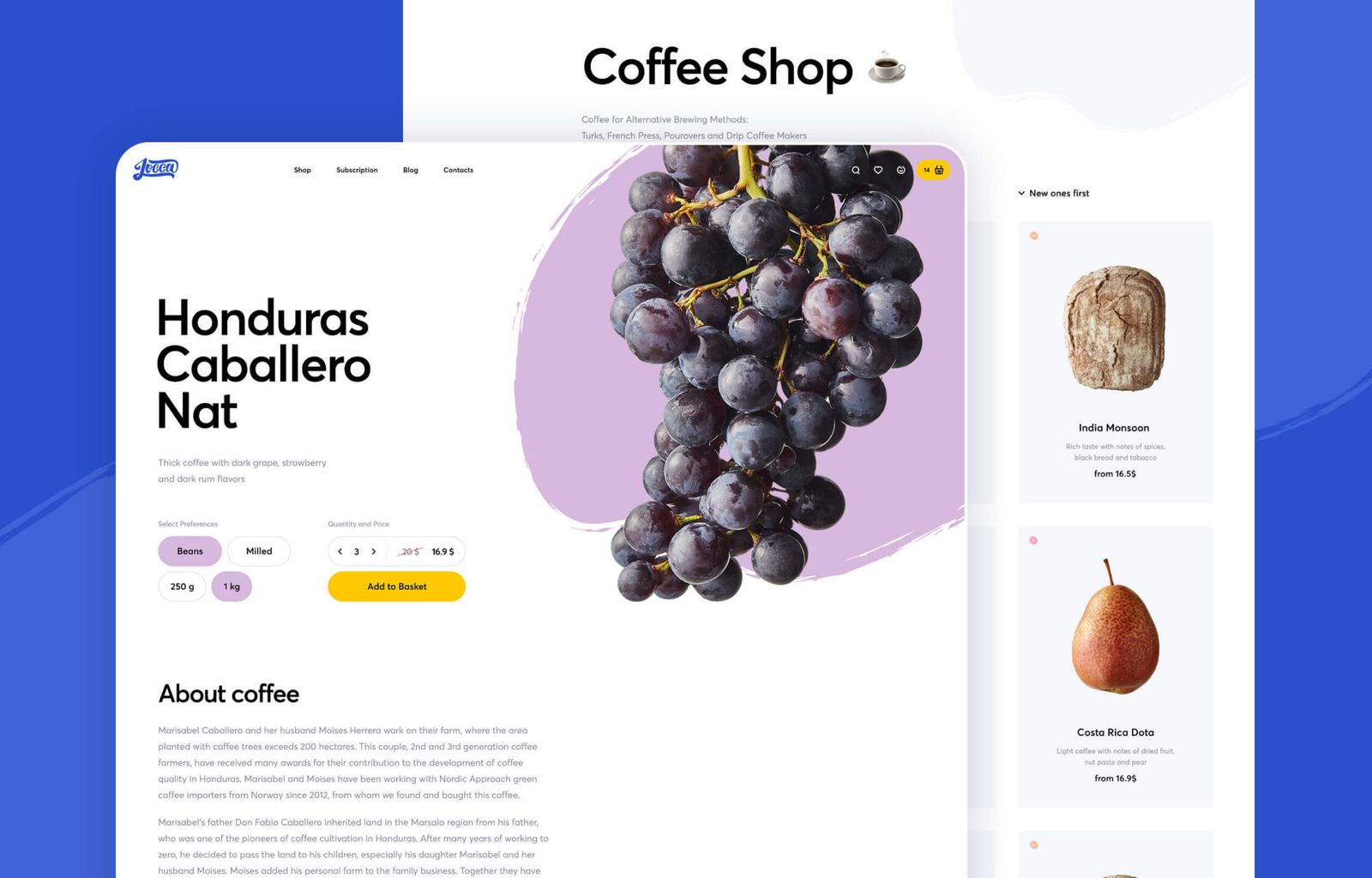
We have formed the optimal customer route for a convenient purchase of the product. The catalog is a grid of products with the image of the main taste, and inside the product card you can select the desired grinding, weight and quantity.
something similar?

UX / UI DesignUser Experience